Aaron Cougle
Growth Product DesignerA portfolio walk-through for hiring teams: two real projects, real data, and how I think about UX from framing through ship.
Design is a
hypothesis
Every design decision is a bet. My job is to reduce the cost of being wrong, through sharp problem framing, tight research, and experiments that generate evidence, not just opinions.
Frame the problem
Understand what we're really solving for before touching pixels.
Learn fast
Research, synthesis, and signal over noise.
Test assumptions
A/B tests, prototypes, and data to validate before scaling.
Ship and iterate
Good design ships. Great design keeps improving.
Mobile Web Email Editor
Constant Contact / PLG Growth
My Role
Product Designer
Timeline
October 2024 – February 2025
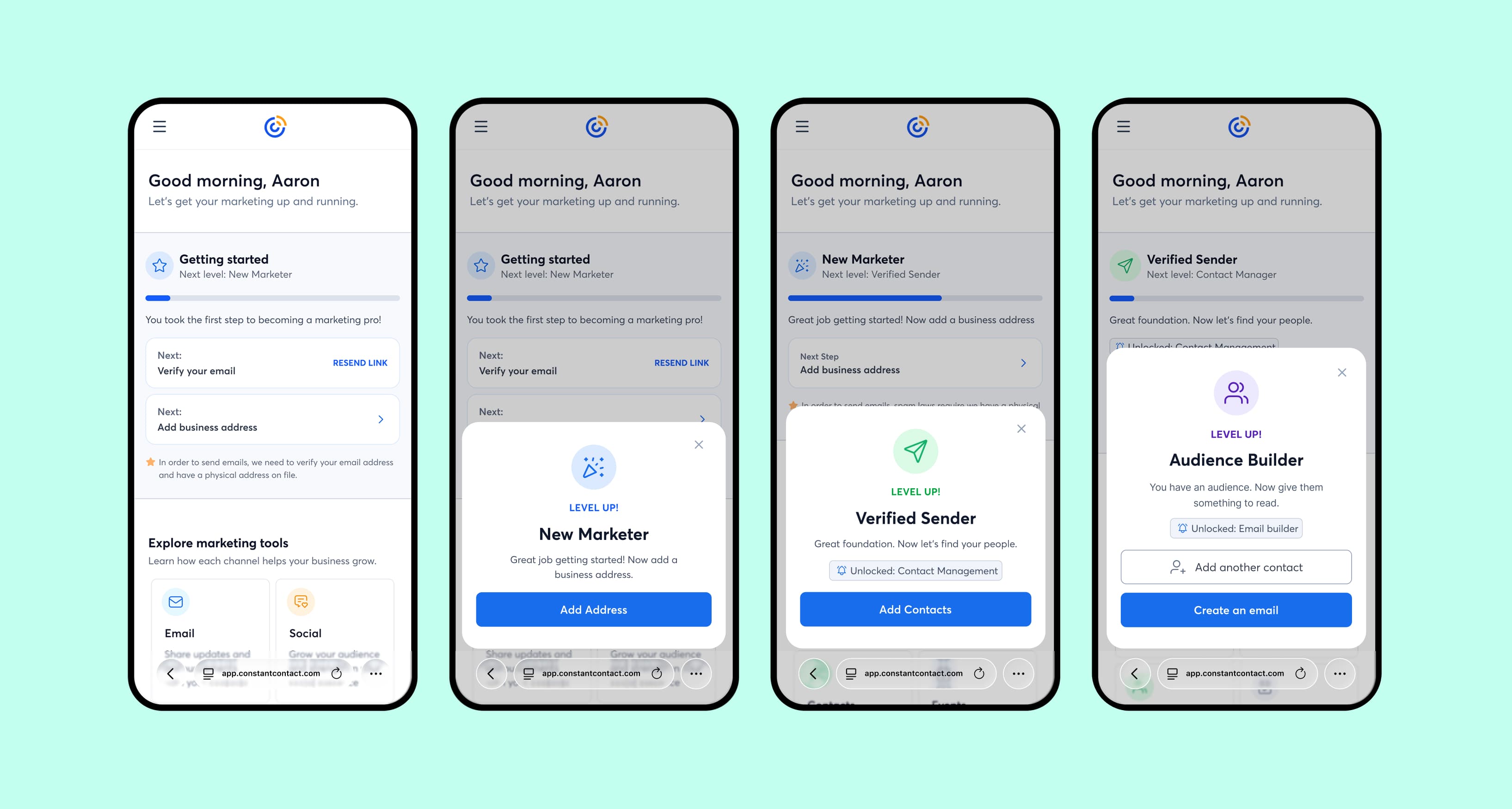
Mobile users couldn't create emails
A minimal editor checks a box. It doesn't give users a reason to iterate on their campaigns or come back to send a second email.
Mobile web had no email editing capability. Users could verify their account, confirm their address, and import contacts, but the moment they tried to create an email, the funnel dead-ended. Every trial user on mobile hit the same wall before ever reaching send.
Signals that triggered this
All mobile web trial users blocked at the email creation step, the critical activation gate
Prior native app research: 10 of 10 participants said they'd want mobile editing immediately
Creator-to-sender conversion stuck at ~20%, half of what it could be
We had the signal. The question was scope.
Rather than restart from zero, I audited prior research from our native mobile app work, an 18-month-old study with strong directional signal. The real design question: how much editor was enough to actually change behavior.
Prior Usability Research
10/10 participants from a previous native app study expressed immediate demand for mobile editing. Validated signal we could build on.
Funnel Analysis
Mapped exactly where mobile web trial users dropped. Email creation was a universal blocker. No user got past it without desktop.
Scope Framing
Defined "enough editor" as the threshold where creator-to-sender conversion would meaningfully lift, not feature parity with desktop.
The editing experience needed to be good enough to actually change behavior, not just satisfy a checkbox.
Adapt, don't rebuild
I partnered with a senior engineer to translate proven native mobile patterns to browser constraints. The architecture was already validated; the challenge was interaction translation, not concept.
Reframe
Scoped to behavioral change, not feature parity. Focused on the minimum experience that would convert creators to senders.
Interaction Mapping
Replaced native gestures with browser equivalents: swipe-to-delete to explicit controls, long-press reorder to tap-and-drag.
Two-Mode Interface
Preview mode (clean email view) and edit mode (block-level controls), keeping the surface clean until the user needed depth.
Block-Specific Sheets
Tailored editing panels per content type: text (font/color/size), image (crop/replace), buttons, dividers. Full control, no overwhelm.
Would quality drive conversion, or just presence?
Hypothesis
"If we build a full-fidelity mobile editor, not just a text box, users will convert from creator to sender at a measurably higher rate."
What we tested
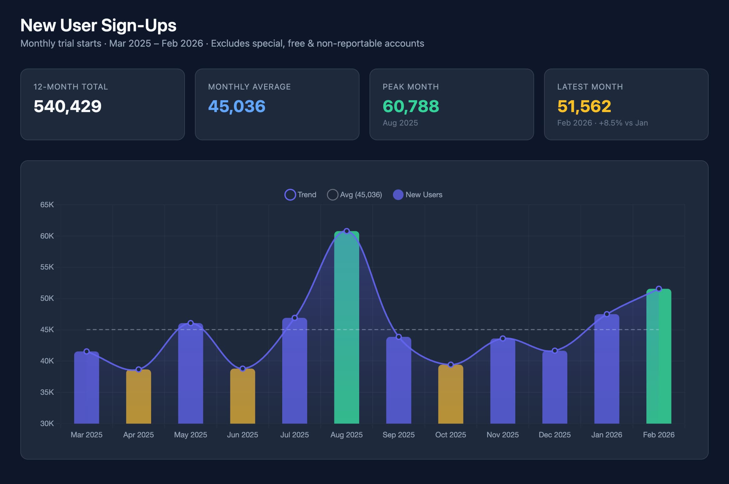
Launched the mobile editor to mobile web trial users starting October, with full tracking in Statsig. Measured creator-to-sender conversion, S1 (first send), and S2 (second send) rates against the prior year baseline.
Why this approach
The hypothesis was that experience quality, not just feature availability, determines whether users return. A minimal editor might unlock sends but kill repeat engagement.
Result
Conversion diverged clearly once the editor launched in December. S1 rate climbed from ~2% to 5-6%. S2 from ~0.7% to 1.5-1.8%. Creator-to-sender peaked at 45%, more than double the 20% baseline.
+2x
Measured lift
The editor didn't just unlock sends. It doubled them.
The Mobile Web Email Editor shipped and directly drove a 2x improvement in creator-to-sender conversion. The bet on quality over minimalism paid out: users didn't just send once. They came back.
+150%
S1 send rate
+125%
S2 send rate
45%
Creator-to-sender peak
Key learnings
Quality threshold matters more than feature presence. A minimal editor would have moved the needle less.
Intentional restraint is a design decision: avoiding desktop feature-creep kept the mobile experience coherent.
Reusing validated patterns from prior research significantly compressed the design cycle without sacrificing rigor.
Simplified Mobile Web Experience
Constant Contact / PLG Growth
My Role
Product Designer
Timeline
December 2025 – January 2026
Mobile web had no structured activation path.
A purpose-built mobile experience with its own sequencing and priorities could outperform the desktop-derived version on every activation metric.
Critical workflows including email creation, contact management, and social account connection either didn't exist on mobile or were buried in desktop-oriented interfaces. Users hit dead ends repeatedly. The experience was architecturally wrong for the medium.
Signals that triggered this
Mobile web users dropping at every activation prerequisite: verification, address, contacts, email
Desktop-derived navigation and structure created cognitive overhead that mobile users couldn't overcome
No progression model. Users had no visibility into what was needed to activate or how far along they were
A three-week experiment across 10,610 accounts
We designed a controlled experiment to isolate the effect of a purpose-built mobile surface against the existing desktop-derived experience. Rigorous statistical validation was central to how we read the results.
Controlled Experiment
10,610 mobile web accounts, direct traffic, 14-day activity window, holiday period excluded to reduce noise.
Statistical Methods
Two-proportion z-tests, t-tests, and Bayesian analysis to validate significance across all primary and secondary metrics.
Activation Mapping
Mapped four prerequisites (email verification, address, contacts, email creation) and measured completion rate for each independently.
Reducing cognitive overhead directly improves activation behavior. Users don't need more options, they need a clearer path.
Build a progression system, not a simplified page
The core insight: users needed a visible path forward. I designed a four-level progression framework that sequenced activation steps and adapted the email surface to where users were in their journey.
Progression Framework
Four prerequisite levels (email verification, address, contacts, email creation) mapped to visible progress and unlocking logic.
Adaptive Email Surface
The email section transformed based on journey stage: first-time visitor, draft creation, performance dashboard. One surface, three modes.
Simplified Contacts
Focused add-contacts interface with manual entry, paste list, and third-party integration, preserving bulk-add after an early iteration showed depth loss.
Iterate on signal
Initial contact sheet reduced multi-add depth. We added a paste flow alongside single-add, recovering bulk functionality without sacrificing simplicity.
AI didn't replace the thinking. It compressed the cycle.
This project ran on a compressed timeline. AI tools were embedded throughout: not as a shortcut, but as a way to operate at senior-designer quality without a full team behind me.
Queried activation funnel data directly in natural language. No waiting on data pulls, no BI bottleneck. Real-time signal during design decisions.
Prototyped interaction logic in code. Faster than Figma for testing conditional states and the progression framework behavior.
Designed the experiment structure and defined metric guardrails before a line was coded, with AI-assisted analysis during the experiment window.
What would have taken a team of three (data analysis, prototyping, experiment design) I ran as one designer. The speed didn't compromise rigor. It removed the waiting.
Every activation metric moved. Nothing broke.
The simplified experience outperformed the desktop-derived version across all primary metrics. Critically, trial-to-paid conversion was neutral. The activation gains carried no monetization risk.
+69%
Accounts sending 1+ emails
+76%
Accounts sending 2+ emails
+83%
Accounts sending 3+ emails
Key learnings
Progression visibility changes behavior. Users activate faster when they can see the path.
Cognitive overhead is a conversion killer on mobile; structure matters more than feature count.
Neutral monetization impact gave leadership confidence to scale. Designing for that guardrail upfront was the right call.
Prototyping in production
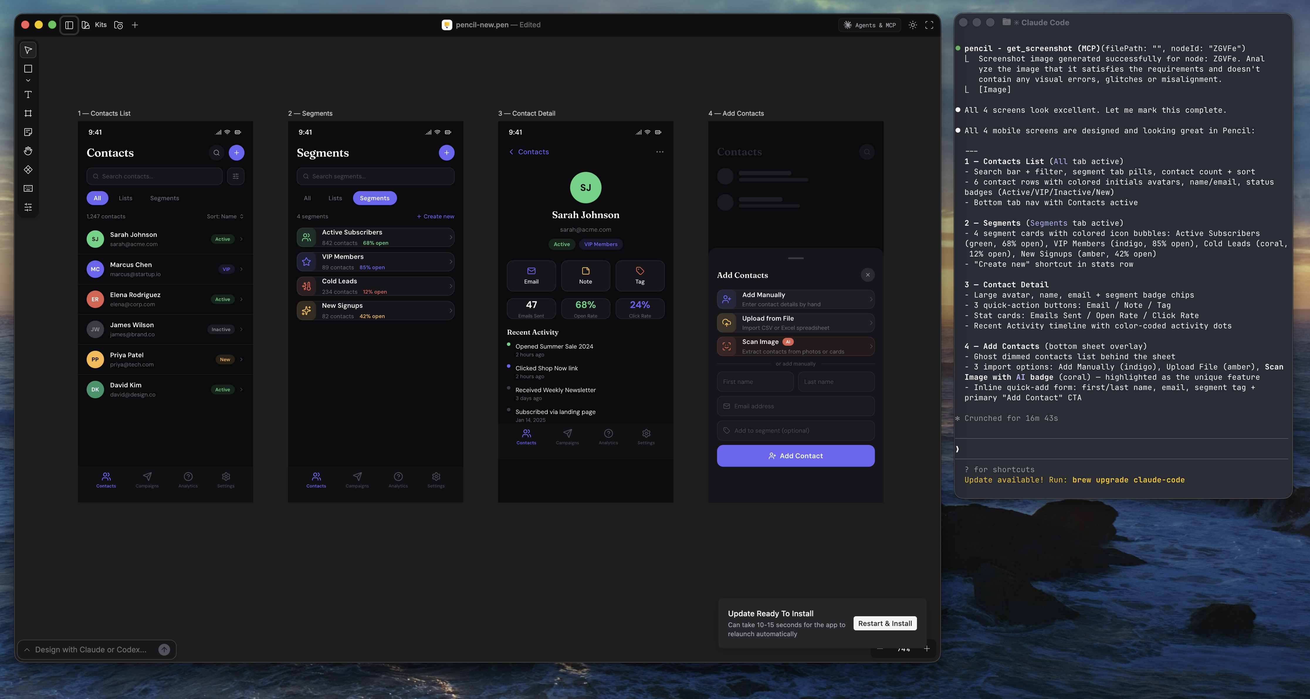
I clone the live production repo, use asset override URLs to point the running app at local files, then use Claude Code to make design changes directly in the codebase. The output is a branch developers can review and ship with no design translation layer.
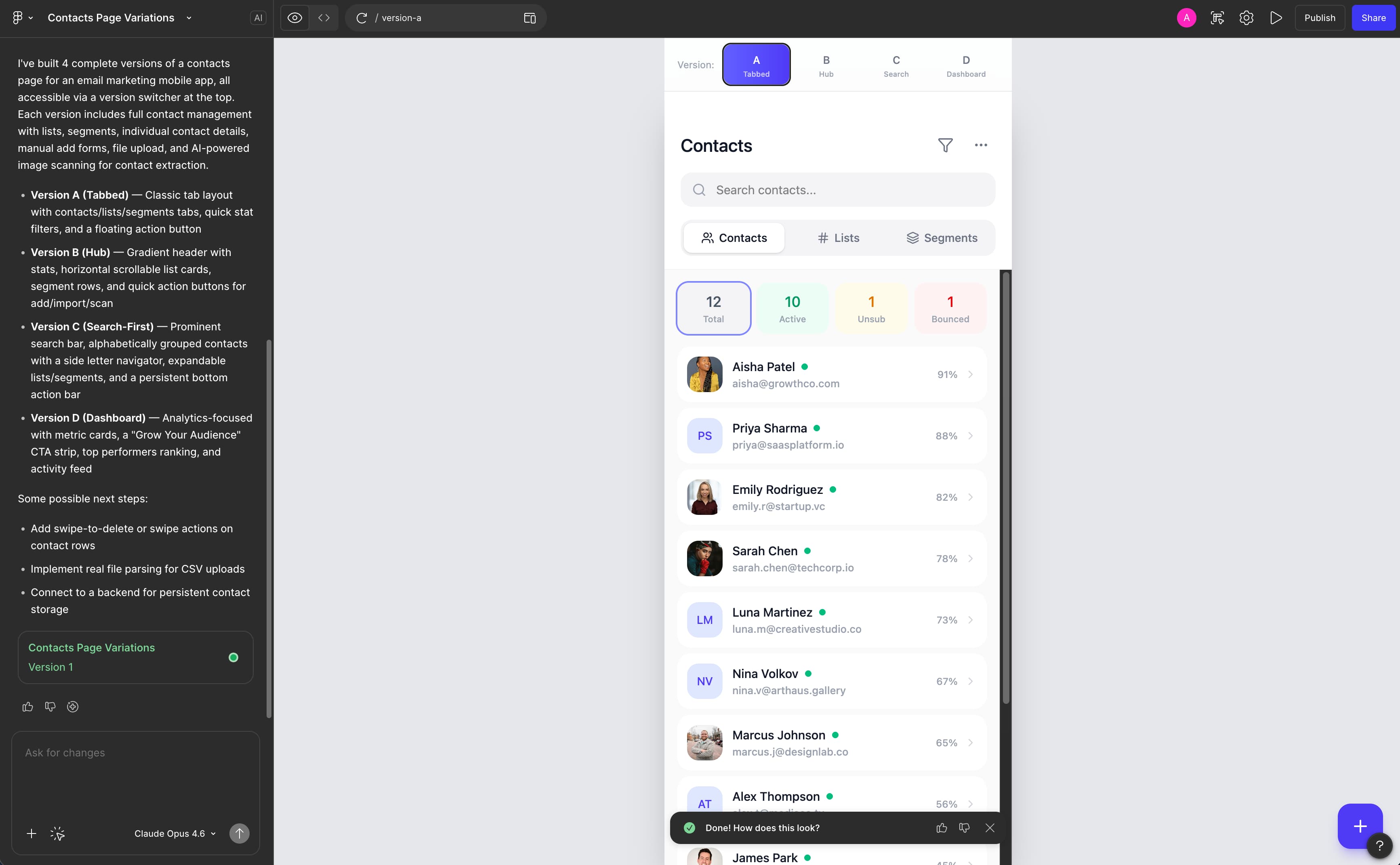
Design ideation
I use AI to rapidly ideate and iterate on design concepts, from early exploration through high-fidelity refinement. This compresses the time between a rough idea and a testable direction.
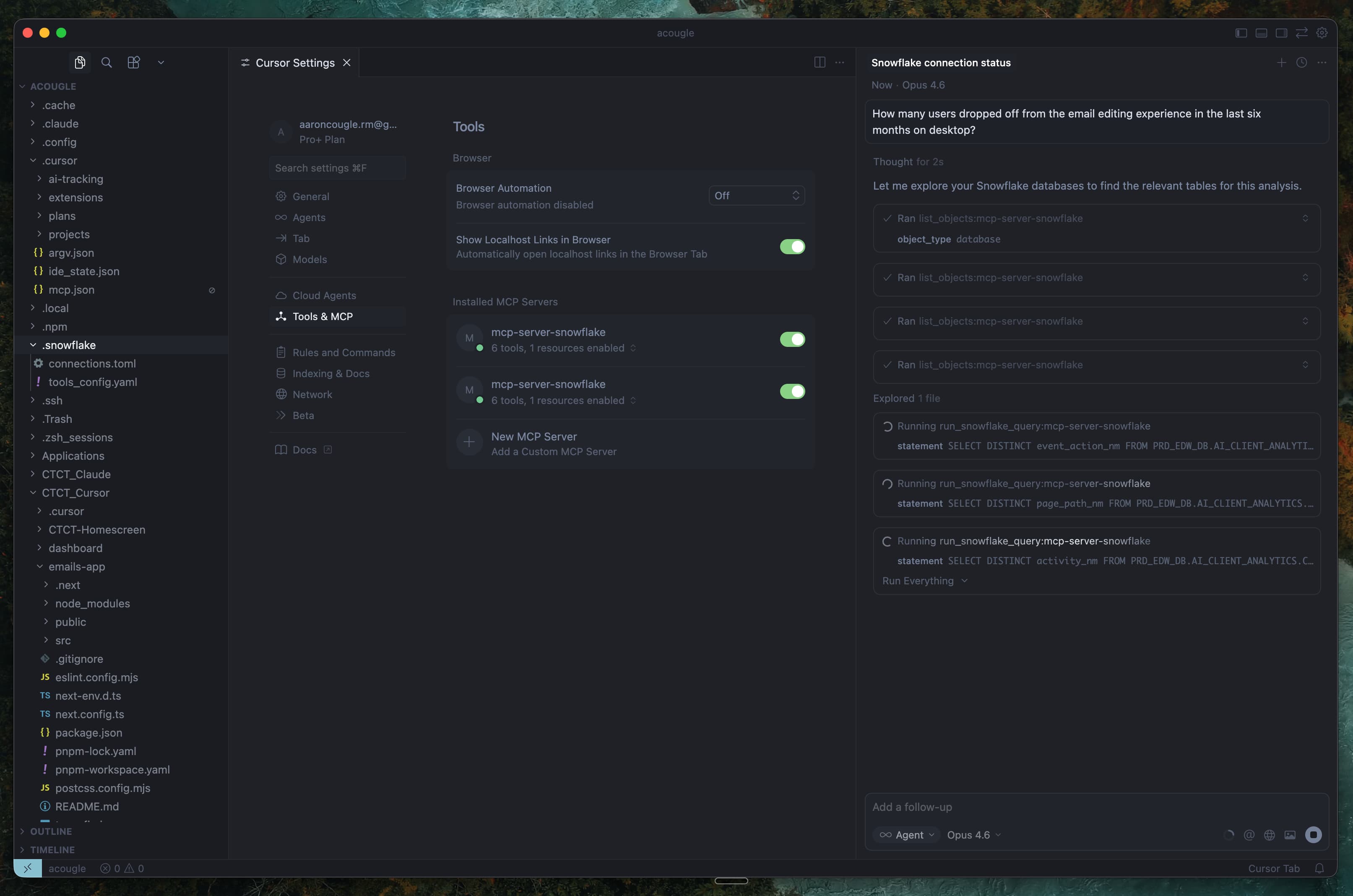
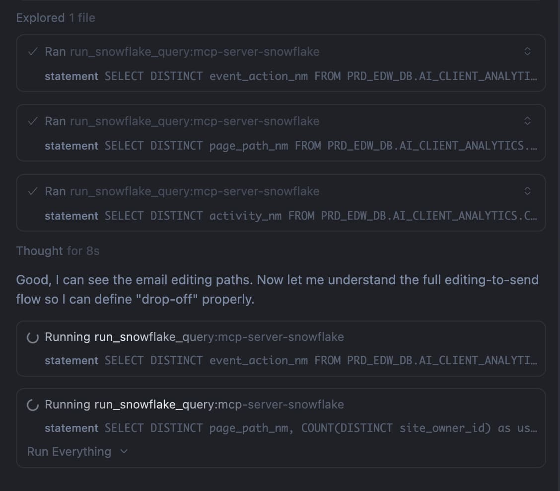
Data analysis
I connect Cursor to Snowflake through an API to explore, query, and understand user behavior data, making design decisions based on raw usage patterns rather than waiting on data pulls.
scroll or arrow keys to navigate